
Quick answer
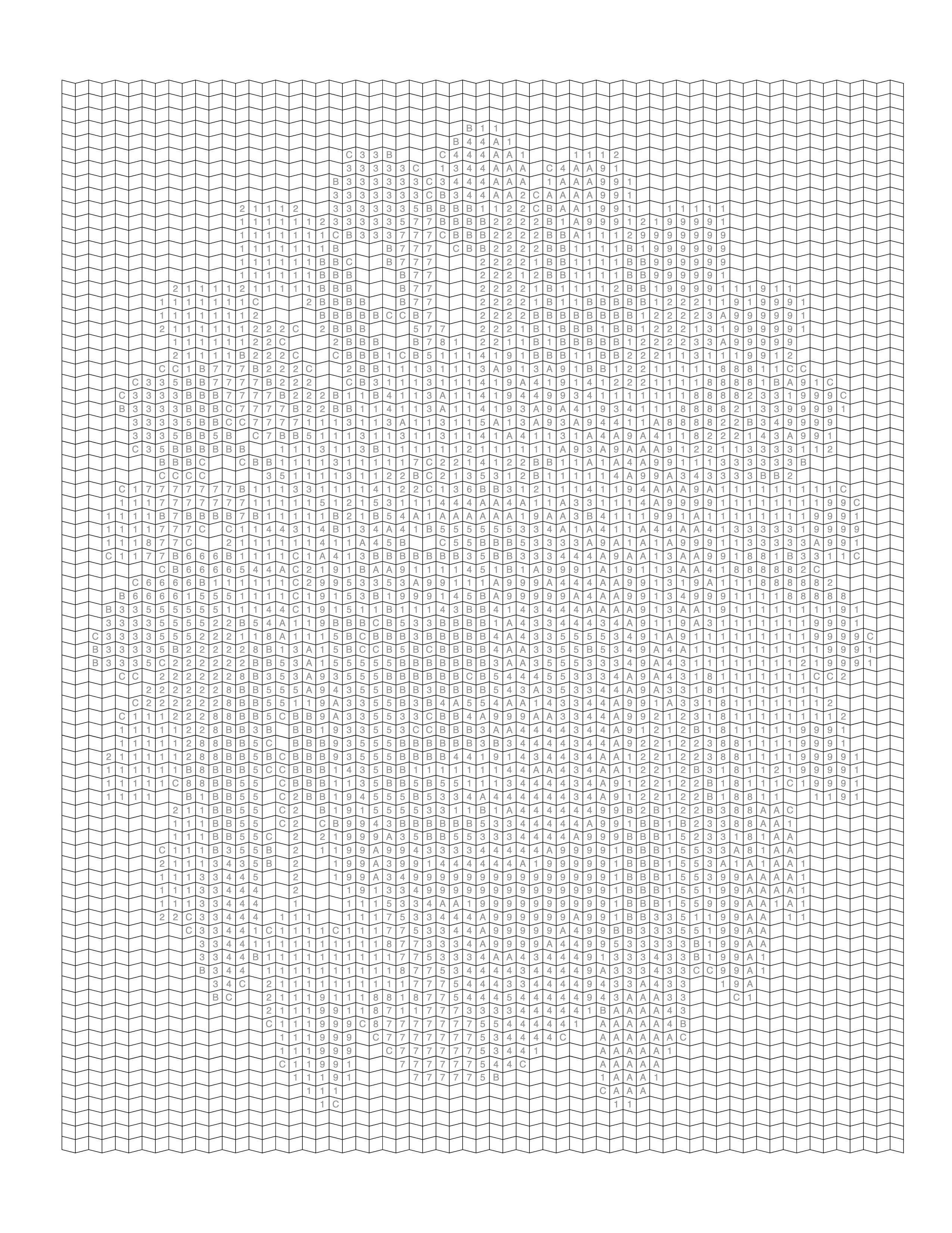
A wedding photo can become a keepsake coloring page in Mosaci, as long as you know what the page looks like. Mosaci does not trace the couple into outlines. It reduces the photo to a limited palette and lays it out as a grid of empty cells, each holding the number of its color. The couple appears as the cells are colored in, and the finished page reads as a mosaic of the real wedding colors. Traditional outline coloring pages, where you choose every color yourself, are a different format. This guide covers the numbered-page workflow and what makes wedding photos behave differently on a cell grid. To make a personalized page from a photo you own, try the custom color by number tool.
Key Takeaways
- Mosaci converts a wedding photo into a numbered cell grid, a filled color-by-number preview, and a palette page.
- A white dress and a dark suit give strong contrast, but each needs more than one palette color to keep its folds and shape.
- A complex ceremony backdrop is the main risk: it takes cells and palette colors away from the couple.
- Lace and embroidery reduce to the dress's dominant tones, because each cell holds one color.
- A close or medium shot of the couple works better than a wide ceremony or reception shot.
How a Wedding Photo Becomes a Numbered Page
Mosaci reads the pixel colors of the image, groups them into the number of colors you choose (4–23, default 12), and gives each cell the closest color. Nothing is traced, redrawn or AI-generated. You choose from 8 color mosaic patterns and 2 monochrome mark styles, so the cells can be squares, hexagons, trapezoids, fish scales and more.
Why Wedding Photos Convert Differently
Most photo guidance assumes ordinary clothing on an ordinary background. Wedding photos have clothes chosen to stand out: a white dress and a dark suit sit at opposite ends of the tonal range. That makes the couple easy to separate from each other. The catch is inside each garment. If the whole dress lands in a single white palette color, its folds disappear and it becomes a flat white shape on the page. The same is true of a black suit. You want a palette with at least two or three tones in the dress and in the suit.
Wedding scenes also tend to have elaborate backgrounds, such as florals, string lights, stained glass and architecture, which compete for the same cells.
Choosing the Right Wedding Photo
Look for a moment where the couple is the clear focus, faces are visible, and the dress and suit both show visible folds rather than being blown out to flat white or crushed to flat black. Portrait-session photos usually work better than candid ceremony or reception shots, where light and framing are less controlled.
Photos to Avoid
Avoid photos where the dress is so overexposed that its folds are gone in the original. No palette can bring them back. Avoid a dark suit against a dark background: both fall into the same color numbers and the groom's shape disappears. Wide shots of the whole wedding party leave each face only a few cells and bring in the overlapping-people problems covered in our guide to family photo conversion. A veil over the face, or a partner turned fully away, also makes the page harder to recognize.
Handling Fabric and Fine Detail
Lace, embroidery and beading are finer than a cell, so they reduce to the dress's overall tones. That is expected; the dress stays recognizable by its shape and shading. To keep more of that shading, use a smaller cell size (the range is 12–36), a tighter pattern such as Trapezoid or Hexagon, and a color count high enough to give the dress several light tones. A sharp, high-resolution source also helps; see our guide to photo resolution for coloring pages.
Step-by-Step Workflow in Mosaci
Photo → Color by Number
- Select a photo where the couple is well lit and stands out from the background.
- Crop to the couple, unless the setting is part of the story you want to keep.
- Check tones in the dress, suit and skin. Lower highlights on an overexposed dress and lift shadows on a dark suit.
- Upload it to the Photo to Coloring Page Converter and choose a color pattern.
- Set the color count and cell size. Start at 12 colors; raise it if the dress or suit turns into one flat color.
- Review the preview, checking that both faces are recognizable and the garments keep their folds.
- Export the print-ready PDF (300 DPI, 8.5 × 11 in) with the numbered page, preview and color key.
Handling Ceremony Backgrounds
Arches, stained glass, string lights and architecture add interest, but each takes cells and can use up palette colors. A colorful floral arch may claim several of your 12 colors, leaving fewer for skin and fabric. You don't have to avoid these backdrops; just be deliberate. Crop to keep the part of the setting that matters and trim the rest.
Bouquets and Florals
A dense bouquet reduces to clusters of cells in its dominant colors rather than individual blooms. A bouquet with a few larger flowers in distinct colors holds its shape better than many tiny ones packed together. The same logic applies to busy backgrounds in general.
Color Patterns or Mark Styles?
Color patterns reproduce the actual dress, suit and floral colors. Mark styles, such as Square Mark or Hexagon Mark, render tone with ink marks in one pen; color count does not apply. Either way, the page costs 1 credit when you download it. A mark style can suit a black-and-white wedding photo. For a color keepsake, start with a color pattern. See Photo to Color by Number: The Complete Guide for more on the process.
Printable Gift Ideas
A finished, framed color-by-number page makes a distinctive anniversary gift, since it ends up showing the real colors of the day. Printed copies of the numbered page can also be a shared activity at a bridal shower, with the color key alongside.
Common Mistakes
The most common mistake is picking the most dramatic wide shot, such as the whole ceremony from the back of the venue, over a closer, better-lit photo of the couple. On a cell grid the couple ends up small and loses detail. The second is not fixing an overexposed dress before uploading, which leaves it as one flat white shape.
Printable Quality Checklist
- Couple stands out clearly from the background
- Dress and suit each show several tones, not one flat color
- Background isn't so busy that it takes over the palette
- Faces visible, not hidden by a veil, shadow or turned away
- In the preview, both partners are recognizable at the chosen cell size
Example: The Three Pages
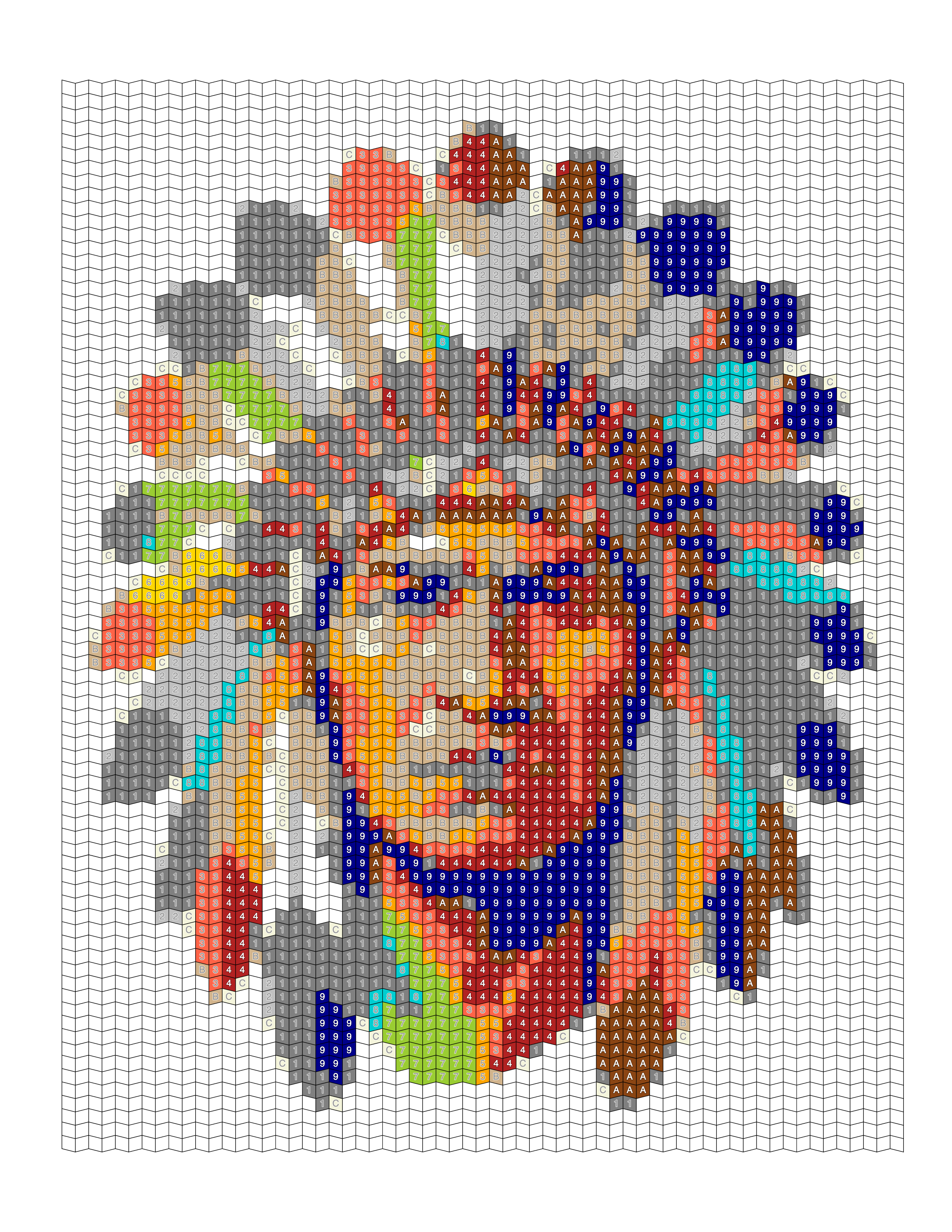
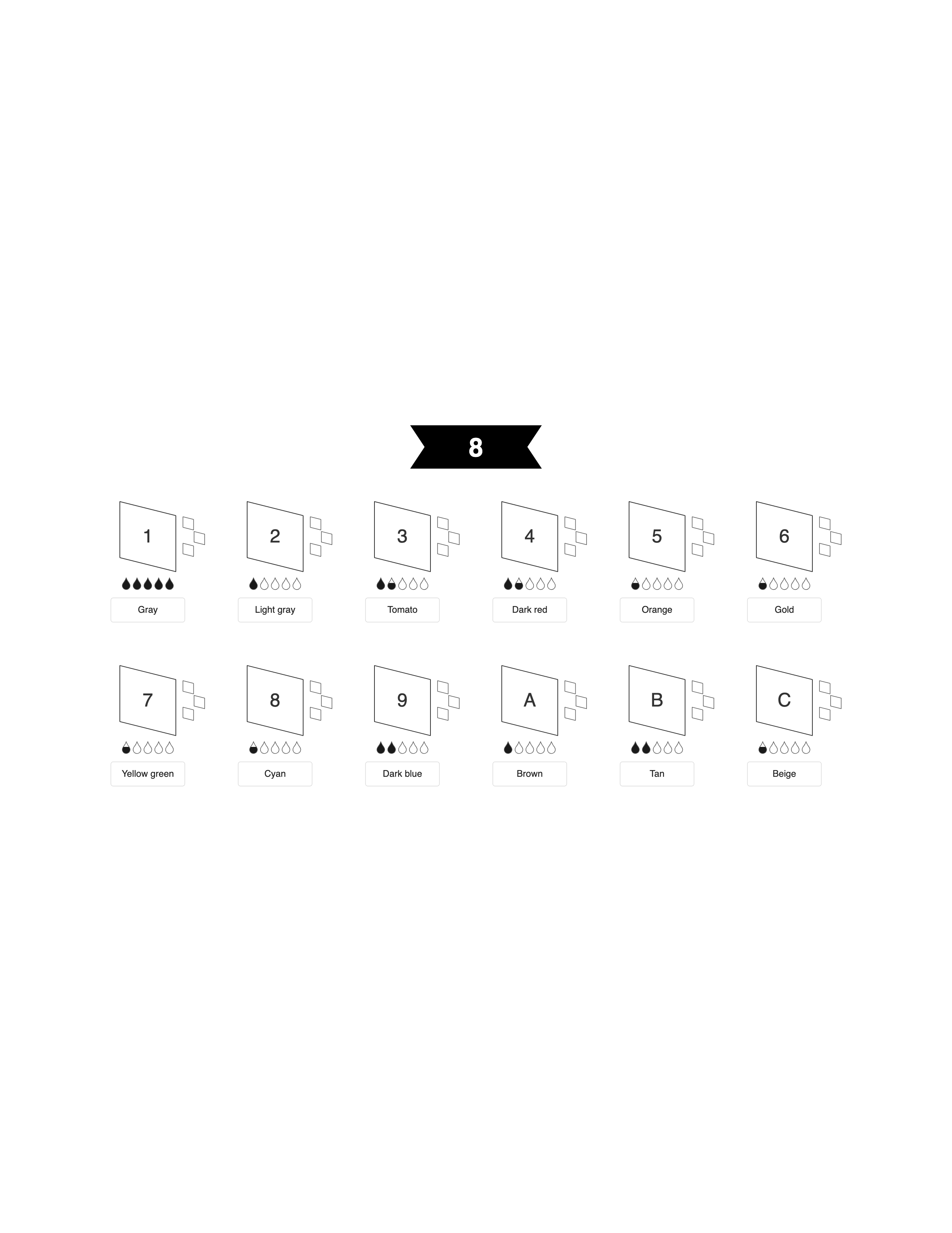
These examples come from a portrait illustration in the Mosaci gallery, not a wedding photo, but they show what every conversion produces: the numbered grid, the filled preview, and the color key. With a wedding photo, the preview is where you check that the dress and suit kept their folds and the faces still read clearly.
Frequently Asked Questions
Conclusion
Wedding photos give a numbered page strong contrast between dress and suit, but they also bring busy backdrops and garments that can flatten into a single color. Choose a close, well-lit photo, crop to the couple, and adjust color count and cell size until both partners and their clothing hold up in the preview. From there it is the same process as any photo to coloring page.
Mosaci is free to start, with 10 free credits per month on every account. Try the Photo to Coloring Page Converter or the Color-by-Number Generator.
Related Articles
Printable quality checklist
- Couple stands out clearly from the background
- Dress and suit both show visible folds, not flat white or flat black
- Background isn't so detailed it takes over the palette
- Faces are visible and not hidden by a veil, shadow, or turned away
- The couple fills enough of the frame to get plenty of cells
Key takeaways
- Mosaci turns a wedding photo into a numbered cell grid, a filled preview and a color key, not an outline drawing.
- A white dress and dark suit separate easily, but each needs several palette tones to keep its folds.
- Complex ceremony backdrops take cells and palette colors away from the couple.
- Lace and embroidery reduce to the dress's dominant tones, because each cell holds one color.
- A close shot of the couple works better than a wide ceremony or reception shot.
- Finished pages work as anniversary gifts, bridal shower activities, or framed keepsakes.
Frequently asked questions
Does Mosaci turn a wedding photo into an outline drawing?
No. Mosaci produces a numbered mosaic coloring page: a grid of empty cells, each holding the number of its color, plus a filled preview and a color key. The couple appears as the cells are colored in. Traditional outline coloring pages are a different format that Mosaci does not create.
What's the best wedding photo for a numbered coloring page?
A close or medium shot of the couple with visible faces, even lighting, and a fairly simple background. Portrait-session photos usually work better than wide reception shots with many guests.
Will a white wedding dress convert well?
Usually, yes. It contrasts strongly with a dark suit or background. The risk is overexposure: if the dress has no visible folds in the photo, it lands in a single white color and turns into a flat shape. Lower highlights before uploading and use enough colors for several light tones.
Will lace or embroidery show up?
Not stitch by stitch. Fine lace and embroidery are smaller than a cell, so they reduce to the dress's overall tones. A smaller cell size and a tighter pattern such as Trapezoid or Hexagon keep more of the shading.
Can I include the whole wedding party?
Yes, but everyone shares the same grid, so each face gets fewer cells. Crop tightly, use a smaller cell size, and make sure neighbors differ in tone or have background between them.
Should I choose an outdoor or indoor wedding photo?
Both work. Outdoor photos often have more even light. Indoor photos with string lights or chandeliers add background detail that is worth cropping down.
Color pattern or mark style for a wedding page?
For a color keepsake, use a color pattern, which reproduces the real dress, suit and floral colors. Mark styles render tone with ink marks in one pen; they can suit a black-and-white wedding photo.
What if the background has string lights, florals, or architecture?
They will be converted along with the couple and can use up several palette colors. Cropping tighter leaves more cells and colors for the couple.
Related tools
Written by
Mosaci Studio TeamThe team behind Mosaci Studio
Mosaci Studio is built to help KDP publishers, Etsy sellers, and hobby artists turn photos into print-ready coloring pages without any design experience.
Published Sep 4, 2026 · Updated Oct 14, 2026